LET US KNOW ABOUT BOOTSTRAP SYSTEM
Bootstrap is used for designing responsive layouts in webpages.The responsive layouts is the way in which elements on the page with different resolution
- Bootstrap containers
- Bootstrap ROWS
- Bootstrap COLUMNS
Bootstrap grid consists of rows and columns
Bootstrap containers:
bootstrap container is an element with class .container.The container is root of bootstrap grid system which is used to control the width of the layout. The bootstrap container contains all the elements in a page.so your page should have following structure. First body of HTML page inside of it you should add container and all other elements inside container
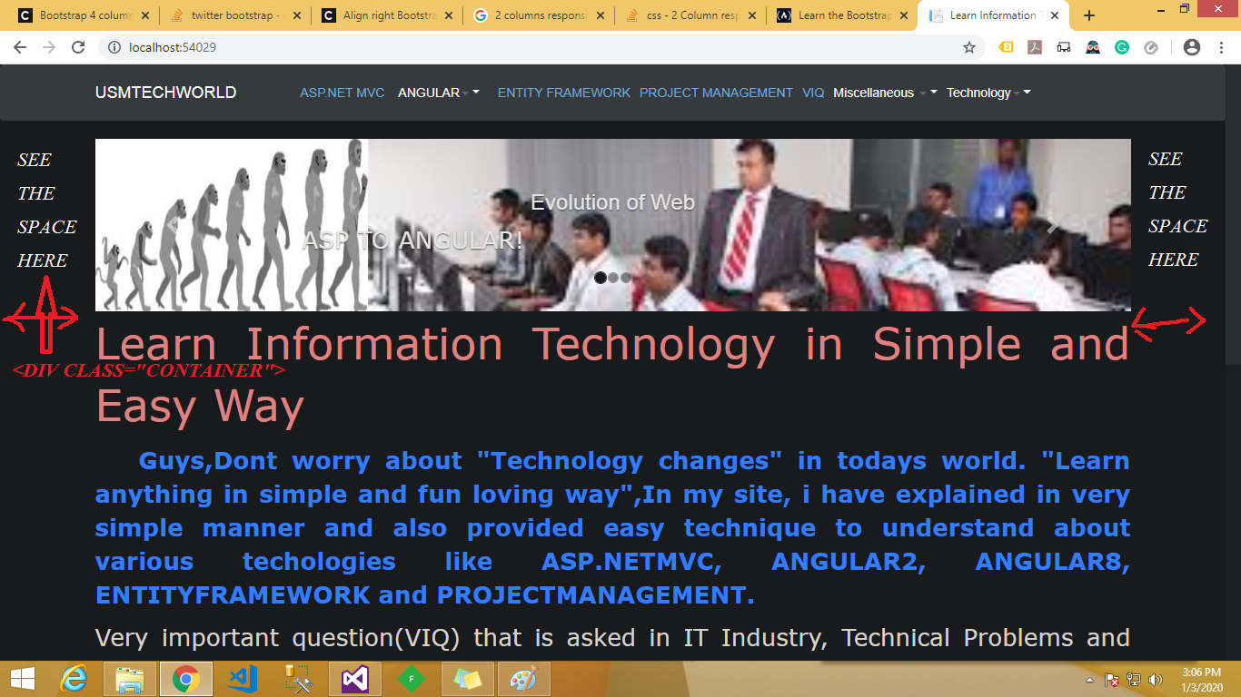
What is container class?
The container class sets width of the layout depending on width of the screen.It places the content in middle of the page aligning it horizontally.You can see the space on left and right of the page and content in the middle.
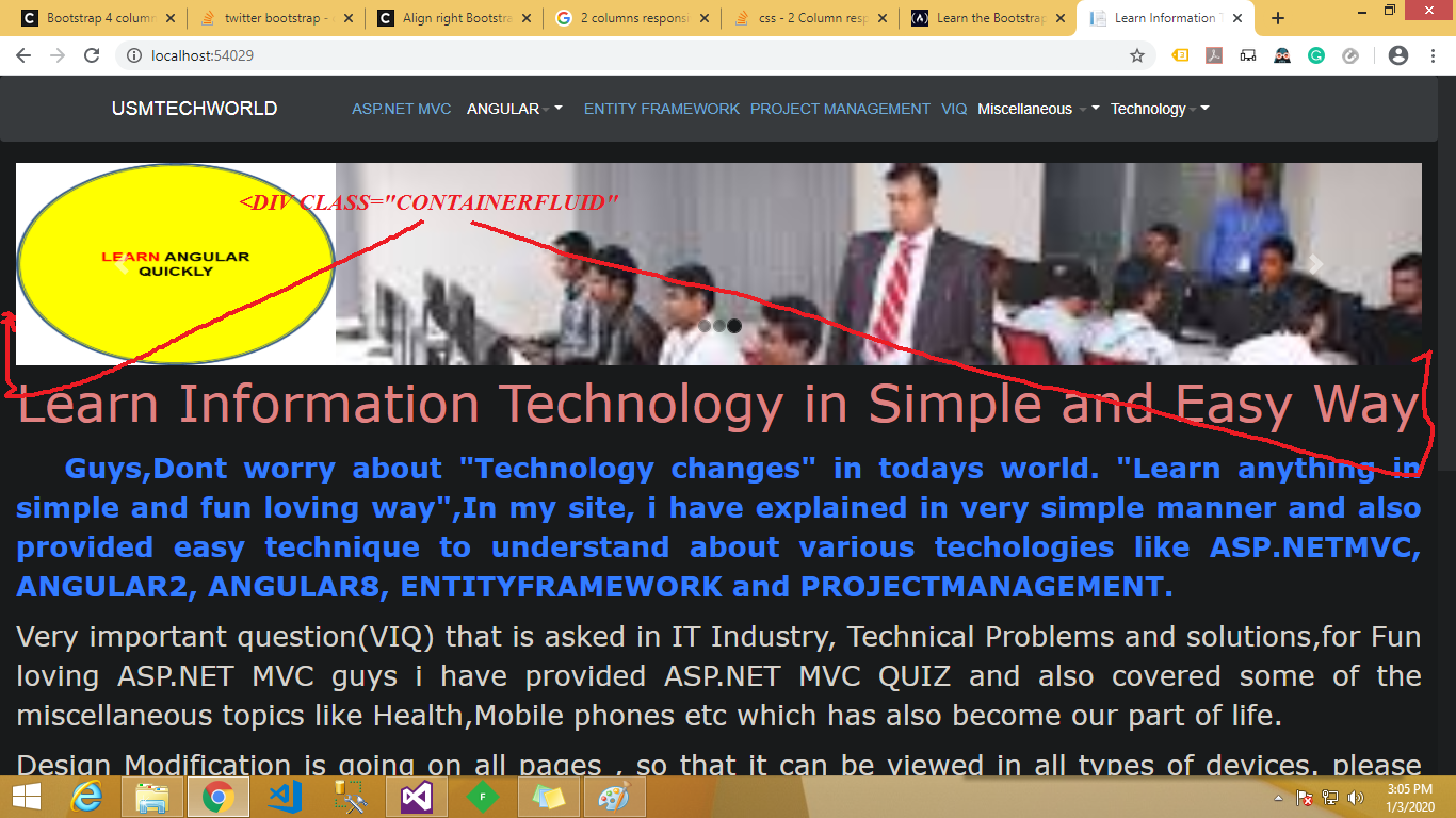
What is container fluid?
it fits full width of the page.you can view both screenshots
Continer image:
Continer FLUID image:
Bootstrap 4 Rows?
Bootstrap 4 rows are horizontal slices of the screen. They are used only as wrappers for columns. To use them, you need the .row class. Here are the most important things you need to remember about Bootstrap 4 rows: They are only used for containing columns. If you place other elements inside the row along with columns you will not get the expected result. They have to be placed in containers. If you don’t do this, you will get a horizontal scroll on your page. This happens because rows have negative left and right margins of 15. The container has 15px paddings so it counteracts the margins. The columns have to be children of the row. Otherwise they will not align. The rows and columns are created to work together in this strict hierarchy.
Bootstrap 4 columns?
We can now get to the nice part of this tutorial, the Bootstrap 4 columns. Columns are great! They help you divide the screen horizontally. If you place a single column in your row, it will take up all the width. If you add two columns, they will each take 1/2 from the width. And so it goes for any number of columns.
Setting Sizes for Columns
Using the .col class sets the width for the column dynamically. That means that depending on the number of columns in a row, the width of a column will be the width of the container divided by the number of columns. But there is another way to define columns. You can use classes for columns and define their size. By default, the Bootstrap 4 grid consists of 12 columns. You can select any size from 1 to 12 for your column. If you want 3 equal columns, you can use .col-4 for each one (because 3*4 cols each = 12). Or you can set different sizes for them.